E1-11 Group 3
Thursday, 15 December 2011
Wednesday, 14 December 2011
Friday, 9 December 2011
Evaluation Question 1- In what ways does your media product use, develop or challenge forms and conventions of real media products?

By Michael and Bethan
Evaluation Question 2 - How effective is the combination of your main product and ancillary texts (the magazine advert and CD digipak)?
After creating the video, we decided that we needed to design a similar style for the C.D panels and the poster. We decided that we wanted to have the star performer on the C.D and poster cover as it would reflect onto the audiences who sings the song and how the power of the star image could attract a wider range of audiences, so we ta
 ken a still camera and we shot in the filming green screen suite in our college.
The reason why we used such and unoriginal destination was because we wanted to create a simple, plain image for the ancillary texts to reflect that the performer not happy and in a somber mood like it is reflected in the video. We taken many shot, the props we used in the design were vital as we introduced alcoholic substances which contends sadness due to the stereotype of him being a depressive drinker, we also included his guitar to indicate that he is also the performer in the video, the audience loves to see a versatile image in the media, they like to see the authenticity of having one sole person being used for the whole filmin
 g and distribution of the song.
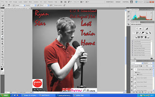
Right Insert: Poster with the insert of text layers and imagery of the companies endorsing the artist.
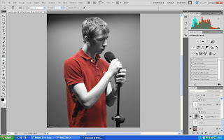
After we decided on our shots we taken the pictures to Photo shop and played around with a few designs, at first we thought we could of created a blurred image to reflect the lack of clarity in the music video between the two performers, then we decided that we might as well created a similar style to the video, yet design the ancillary texts with a design not used in the video, so what we decided to do is created a black and white filter, just like one of the lip syncing clips in the video. We then had some time to reflect on our decision and we decided that we needed some colour to catch the audience’s at
 tention, so what I decided to do was to create a red filter over the image, i coloured in every red area in so that the main colour scheme was gray and red, this then portrayed a bright red blur in the middle of the panel and poster which would be more attention grabbing with the induce of colour.
Right Insert: Original photograph for the front cover of the C.D case.
For the inside of the panel, we decided that we wanted to imprint the lyrics on the left hand side of the C.D so that the audience could perform the track themselves as many people prefer to sing ballad typed songs than any other genre, the right panel included a bio about Ryan Star, the reason behind this is because Ryan Star is not known as a fully established star so if the audience could be given better information about Ryan Star, it would be easier to indicate a product that he brings out at a later date.
Evaluation Question 3- What have we learned from audience Feedback
We asked a sample audience for there views on our music video and to give us some feedback. Below it shows the feedback we requested from our sample audience.
David Lloyd- The camera work was good. Elements that I like were the shaky effect where the boy was in the park and he was running and really drunk. I think that the settings are appropriate and the costumes link in well with the video. I think that the target audience is young teens to young adults. I particularly liked the lip-syncing, which was done by Michael in the studio I thought that was done very well. Overall I think that the video is good.
Maryam Ismail- I think the camera work fits well and particularly I liked the transitions that were between the shots. I think that the setting was very appropriate as it is a love story, again the costumes fit well as it is typical casual clothing that people of our age actually wear which makes it feel more realistic. The video is probably aimed towards teenagers and young adults. My favorite scenes are at the train station where the boy walks away because at the start of the video I thought the boy and the girl would get together but he walks away so its an interesting storyline through out the whole video.
Adam Smith - I think the video was good I liked the whole video in general I liked the ending in particular it demonstrated the feelings of the male lead very well, emotionally invoking. The settings of the scenes are good and not to over the top like many people have in there music videos. The camera work is really good as well and I liked the fact that both characters got into character and it feels more realistic.
Kate Blair- I think that the camera work was on and off, I could see some parts were rushed. But overall it was pretty good. I like the effects you put on the clips. It captured the emotion of the ballad style song. I particularly like the scenes shot in the park and you went back and forth showing emotions at “happy times”. I feel that you were efficient considering the resources you had. I liked the costume, I thought that it was nice and stylish, fitting in with the genre of the music and setting of the video. I think that the narrative needed to be stronger and apparent, it was rather vague. The story of about the relationship was unclear, why did they separate? It could have been structured better. I also think that the lip-syncing wasn’t in line with song.
Holly Atkinson –
I have to give credit to the camera work in it looked really professional and I liked how showed the emotions of the characters involved. I liked the different filters and effects like shaking off the camera when Michael was in the park and drunk. I like the fact that it didn't go with the majority of the types of videos that are on the music channels now that just feature guns, drugs and girls in bikinis. I also liked the fact that it wasn’t a “typical” love story music video.
Leah Andrew- I think the video was good I liked the video in general. The settings were good. I liked it, the use of ideas for example the idea of where the performer Michael was drunk and depressed and went rushing around Manchester looking for his girlfriend. The props that were used My favorite scene was at the end where the couple walked past giving it a great level of emotion. Overall I think you did a great job.After requesting feedback from a sample audience, our music video received really positive feedback.
A typical comment was that it was creative and the ideas for the storyline was really good. This storyline also related to some people’s lives and so this immediately interested them.
The audience’s overall response from the video was that we had used a wide range of different shots, from close up shots to location shots; to stimulate interest. The use of different types of shots encourages the audience watching the music video to perceive it in different ways, and also creates a successful and professional feel towards the music video.
Another strength that was given was the lip-syncing, which was done by Michael in the studio. A comment we received by the audience feedback was the lip-syncing was done in time and matched the lyric of the songs perfectly.
Not all music videos are made the way people want it. There are things within our music video which we could have improved on and made better.
The audience, which viewed our music video, felt some of the lip-syncing wasn’t in line with the song.
Another problem addressed was that the narrative needed to be stronger and apparent, it was rather vague. And the story should have been clearer about the relationship.
From our audience feedback we have learnt a lot, the audience feedback picks out both positives and negatives about the music video and it allows us to get an idea of what people think of it, and what can be done to make it better.
Evaluation Question 4-How did you use media technologies in construction and research, planning and evaluation stages?
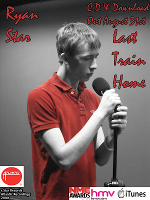
Final Poster Design

This is our final poster design, the man features of our poster is the black and white filter, with the insert of a red colouring on Michael's t-shirt, this creates a somber, negative approach to the album, this is vital for the target audience as it is a soft, slow rock genre that we tried to promote during our advertisement of our music video. We then created a text layering informing the reader of who the artist is, what the album is called and the release date, we created a stroke boarder around the text to make the text more eye catching if the audience is walking past the poster, the border is also important as it creates a contrast in colours throughout the poster of three major colours, Red, Gray and the border Black.

We also inserted images of the record company for copyright issues and we also inserted two companies which sell the music for Ryan Star, Hmv and itunes, the reason why we chosen the these two companies was because they are major music record shops, so the target audience will be able to easily access the album from there desired company. We also inserted a unique item of an award nomination, this was an easy decision for us to insert the item as it would connote that the music is a award winning piece of music, so more people would be attracted towards buying the album.

By Michael Redmond