After creating the video, we decided that we needed to design a similar style for the C.D panels and the poster. We decided that we wanted to have the star performer on the C.D and poster cover as it would reflect onto the audiences who sings the song and how the power of the star image could attract a wider range of audiences, so we ta
 ken a still camera and we shot in the filming green screen suite in our college.
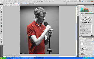
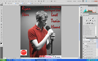
Left Insert: Poster was filtered in black and white, then added colour to Michael's shirt.
The reason why we used such and unoriginal destination was because we wanted to create a simple, plain image for the ancillary texts to reflect that the performer not happy and in a somber mood like it is reflected in the video. We taken many shot, the props we used in the design were vital as we introduced alcoholic substances which contends sadness due to the stereotype of him being a depressive drinker, we also included his guitar to indicate that he is also the performer in the video, the audience loves to see a versatile image in the media, they like to see the authenticity of having one sole person being used for the whole filmin
 g and distribution of the song.
Right Insert: Poster with the insert of text layers and imagery of the companies endorsing the artist.
After we decided on our shots we taken the pictures to Photo shop and played around with a few designs, at first we thought we could of created a blurred image to reflect the lack of clarity in the music video between the two performers, then we decided that we might as well created a similar style to the video, yet design the ancillary texts with a design not used in the video, so what we decided to do is created a black and white filter, just like one of the lip syncing clips in the video. We then had some time to reflect on our decision and we decided that we needed some colour to catch the audience’s at
 tention, so what I decided to do was to create a red filter over the image, i coloured in every red area in so that the main colour scheme was gray and red, this then portrayed a bright red blur in the middle of the panel and poster which would be more attention grabbing with the induce of colour.
Right Insert: Original photograph for the front cover of the C.D case.
For the inside of the panel, we decided that we wanted to imprint the lyrics on the left hand side of the C.D so that the audience could perform the track themselves as many people prefer to sing ballad typed songs than any other genre, the right panel included a bio about Ryan Star, the reason behind this is because Ryan Star is not known as a fully established star so if the audience could be given better information about Ryan Star, it would be easier to indicate a product that he brings out at a later date.
No comments:
Post a Comment